overview
An easier way to purchase and scan movie tickets
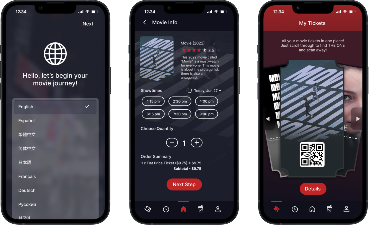
CineMa is a mobile ticketing app that gives movie enthusiasts a convenient and easy way to purchase and scan movie tickets. CineMa aims to ease the process of mobile ticketing overall and offer users a smooth experience.
understanding users
Looking at the needs of the users
Moving forward, I created user personas that represented different users in order to help with identifying different user pain points. The persona below is Zhao, a 42 year old female:

Zhao
42 / Female
Zhao is from China, and she recently moved to the US with her husband and two children. Zhao and her family speak very limited English, but they enjoy going to the movie theaters for family day.
Zhao's Goals
-
Buy multiple tickets for her family easily
-
Purchase tickets without needing to speak English
-
Browse all movies in different languages
Zhao's Pain Points
-
Zhao cannot communicate to workers at the theater due to limited English
-
Movie options are not available in Chinese when purchasing in person
Ideation
From paper to prototype
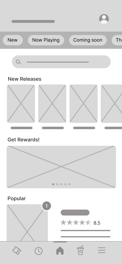
To start the design, I began by sketching paper wireframes to get a basic idea of the app before converting them onto digital platforms.
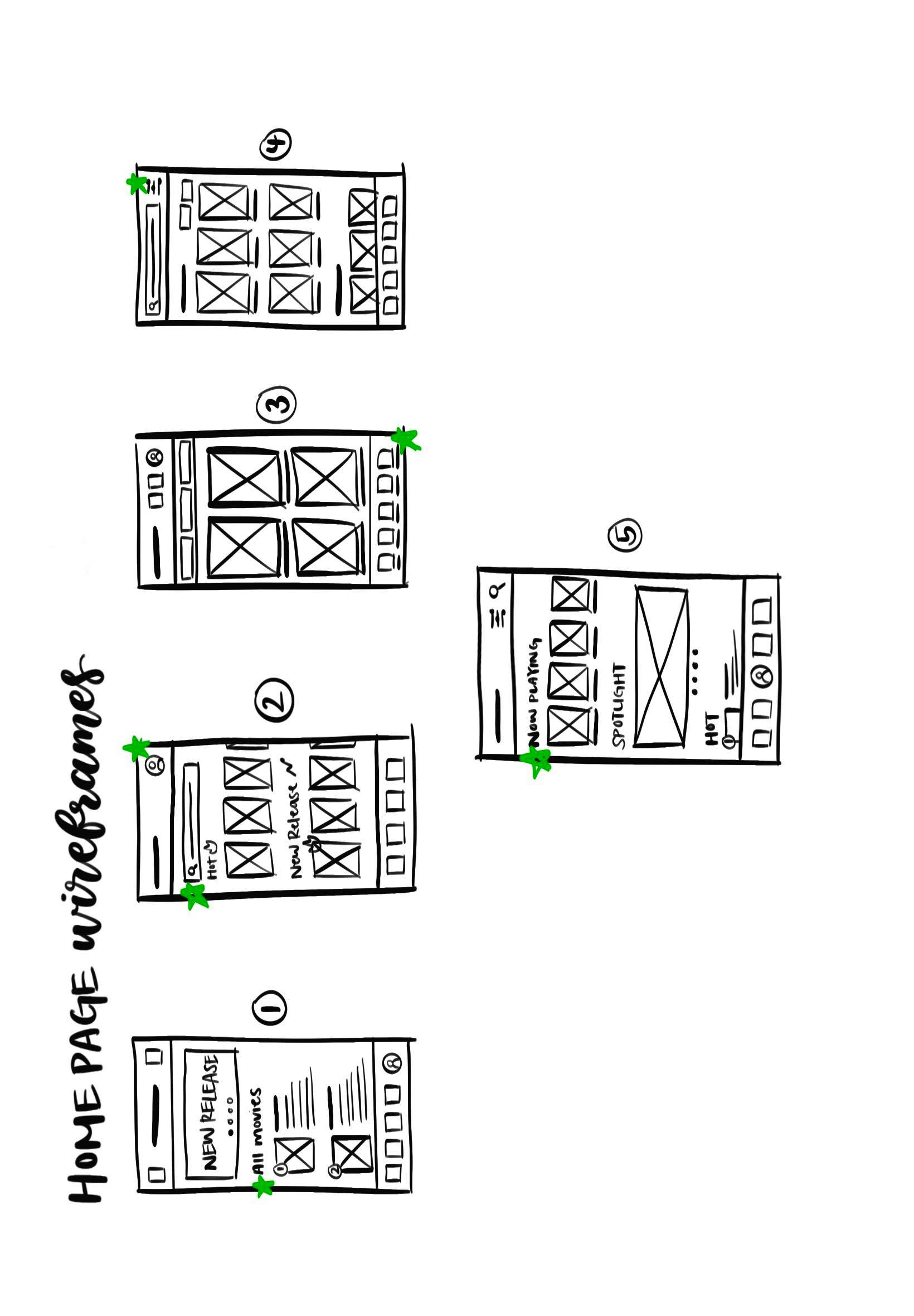
Paper wireframes showing multiple iterations of the home screen
After creating these wireframes, I brought them over to Figma and made low fidelity wireframes, which I then turned into a working lo-fi prototype.

Low-fidelity screens of the main user flow
View mid-fi prototype
User Testing
The problems with my current design
After building the low-fidelity prototype, I moved on and conducted my first usability study, from which I gathered new insights:
- Lacked language options
- Users need to be able to review their ticket order
- There should be the option of bundle scanning
Upon iterating on my low-fidelity prototype after the study, I created high-fidelity prototypes for my second usability study, where I gained more findings:
- The user flow was missing a seat selection feature
- Some gesture and touch options were not working
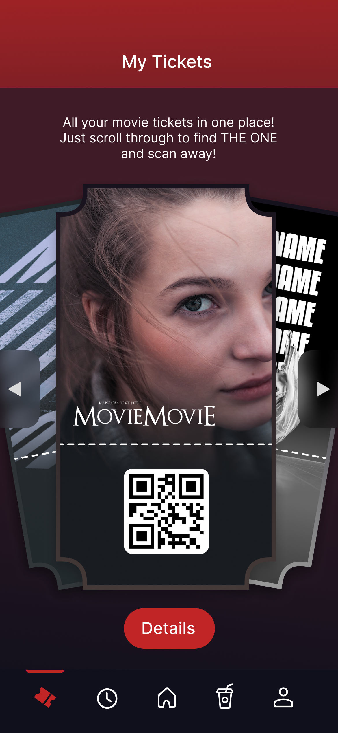
- Movie titles should be includes in the tickets
Making changes
Making improvements based on study results
After conducting the usability study, I made some changes to my high-fidelity prototype!
Seat Selection: Adding seat selection is a crucial feature for users to order movie tickets, offering a convenient way to choose seats.
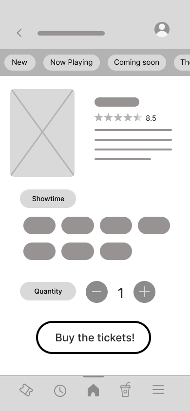
Before
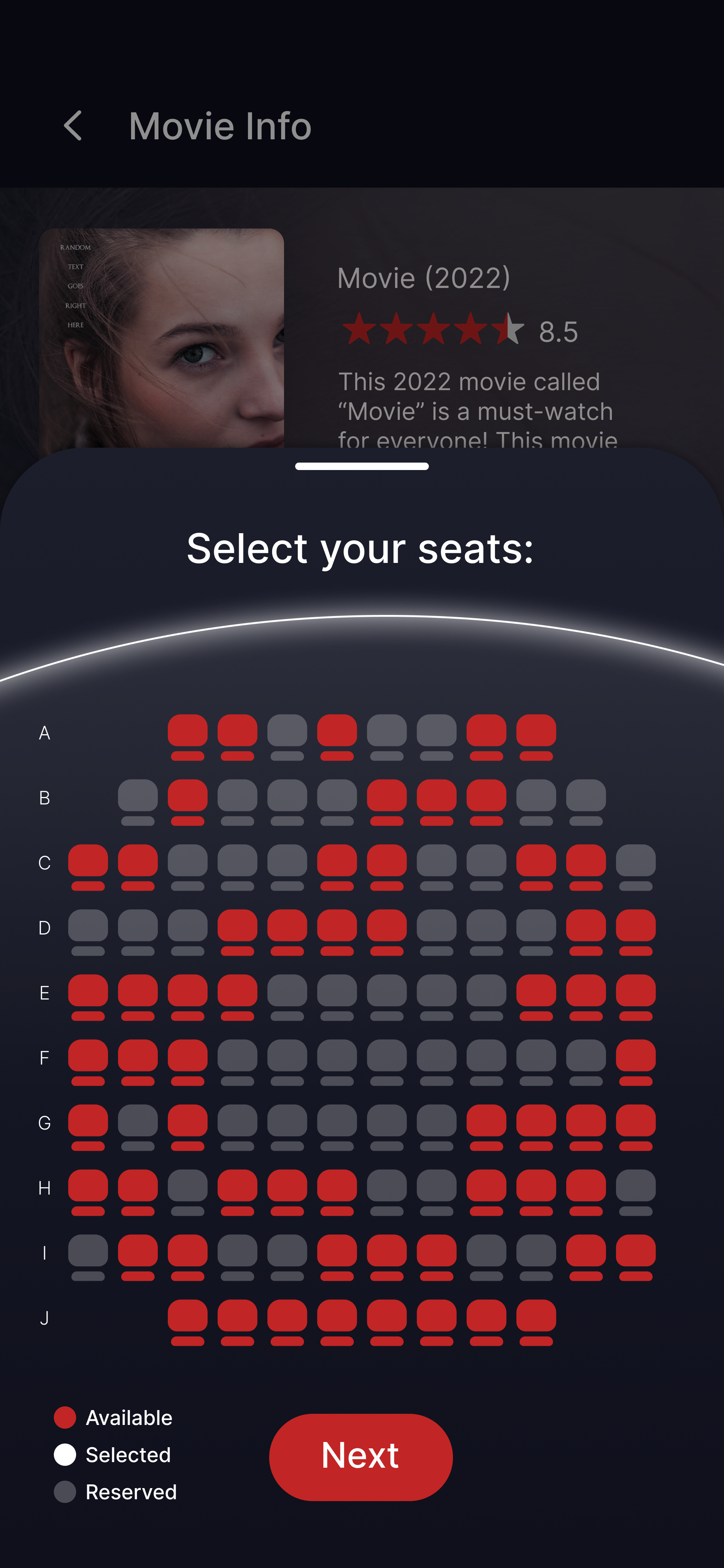
After
Language Options: Adding language options is a must to improve accessibility for many users whose preferred language is not English.
Before
.png)
After
Final product
The final high fidelity design
Here are the high fidelity screens we designed on Figma.
.png)
Language selection
.png)
Home
Scheduling

Seat selection
View hi-fi prototype
Final Product
CineMa's Style Guide
While I was creating my high fidelity prototype, I compiled the components that I used (buttons, typefaces, color schemes, etc) into a single sticker sheet.
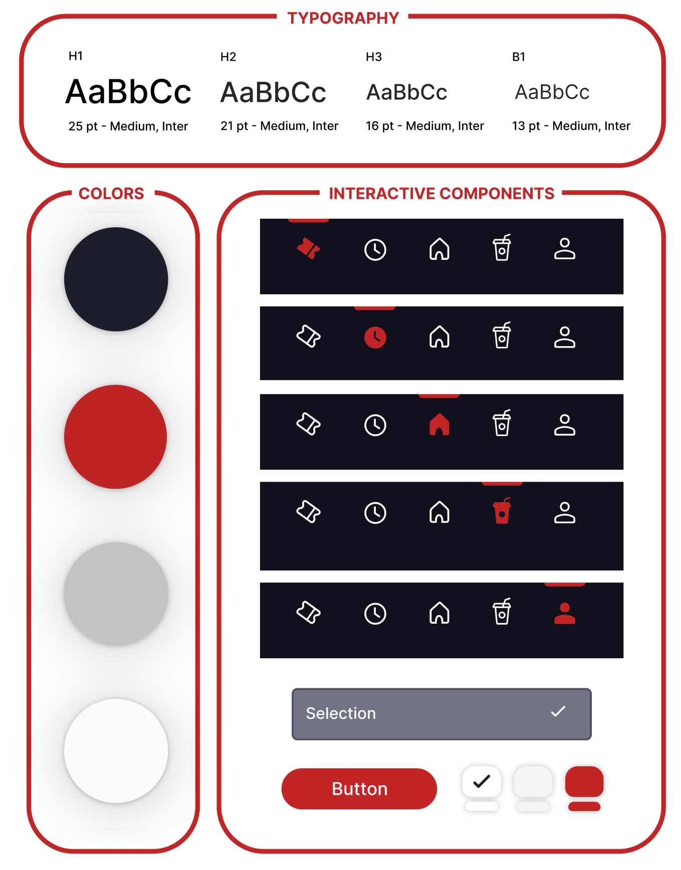
Style guide sheet
Accessibility
Taking accessibility into consideration
The first step that users take in my app is to choose their preferred language. Because this is the first step, users do not have to spend extra time trying to figure out how to change languages within the app's settings.
With contrasting colors, the app is more helpful to those with visual impairments, as the high contrast will ease their ability to read the contents of the app.
I have put labels on the movie posters after the user purchases tickets. This allows the screen reader to detect what movie ticket the user is browsing through.
Takeaways
What I learned from this
I learned that user opinion often differs from my expectations, which made me realize the important of user feedback and research because the end product would definitely not be user centered without the research.

