overview
People forget to take their medicine
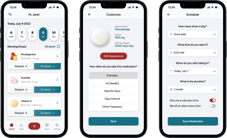
Many people who have to take medicine end up forgetting to take it because they do not have a proper system set up to remind them. Forgetting to take medication on time can lead to a worsening of symptoms and may decrease the effectiveness of the medication. MedTime is an app that reminds people to take their medication on time. This app will be helpful to those who suffer from forgetting to take their medicine.
competitive audit
The lack of a cross-platform experience
To work towards understanding the users I am designing for, I did research by conducting competitive audits as part of my ideation process. Through the competitive analysis, I realized that the competition only offered mobile apps. With that in mind, I used this project as an opportunity to bridge this gap.
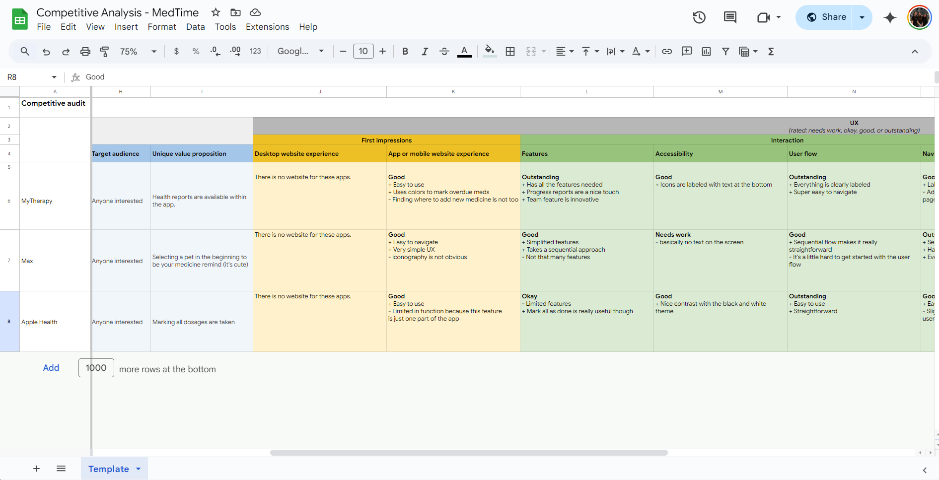
Conducted a competitive audit to identify gaps in the medicine reminder realm
View full audit
understanding users
Looking at the needs of the users
Moving forward, I created user personas that represented different users in order to help with identifying different user pain points. The persona below is Bill, a 71 year old male:
Bill
71 / Male
Bill is from Los Angeles. Unfortunately, he has developed diabetes and dementia, so he needs to take three prescribed medications. Due to dementia, he often forgets to take them, so he hopes to find a good solution to receive reminders.
Bill's Goals
- Remember to take his medication everyday
- Know exactly when to take which medication
Bill's Pain Points
- Bill always forgets to take his medicine, so his family has to remind him, but they don't always remember
- Forgetting to take his medication can lead to some serious issues
Ideation
From paper to prototype
I sketched multiple iterations of paper wireframes for multiple screens to get started with the design. I put stars next to any features I might consider keeping in the next iteration of the designs.

Paper wireframes showing multiple iterations of the home screen

Low-fidelity screens of the main user flow
View mid-fi prototype
User Testing
The problems with my current design
After building the mid-fidelity prototype, I used it to conduct a usability study, and from it, I gained many new findings about how to improve my designs:
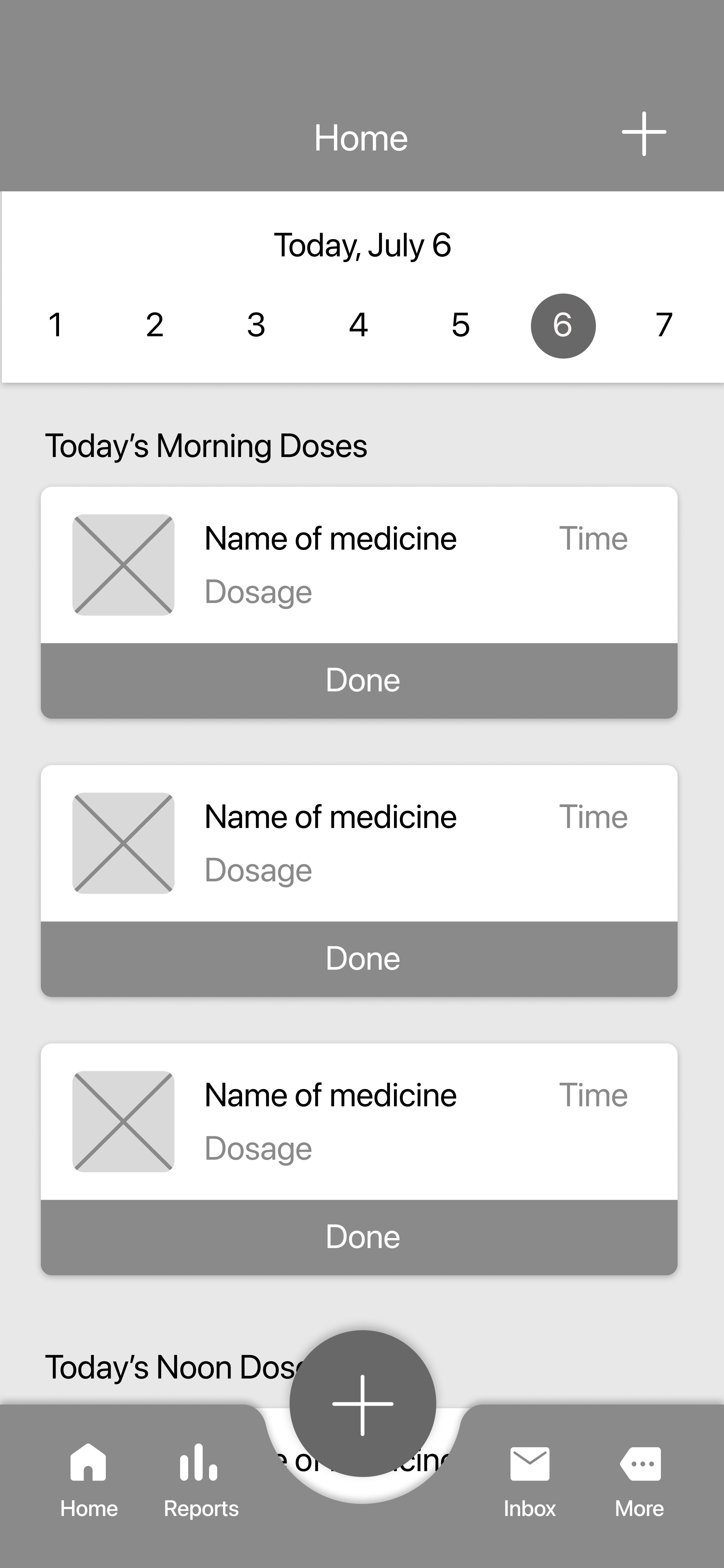
- The two add buttons on the home screen caused confusing navigation for most users
- The lack of a mark all as done button creates inconvenience for users
- Although the primary add button is large, it is not the most visible because it lacks contrast
Making changes
Making improvements based on study results
After conducting the usability study, I made some changes to my high-fidelity prototype!
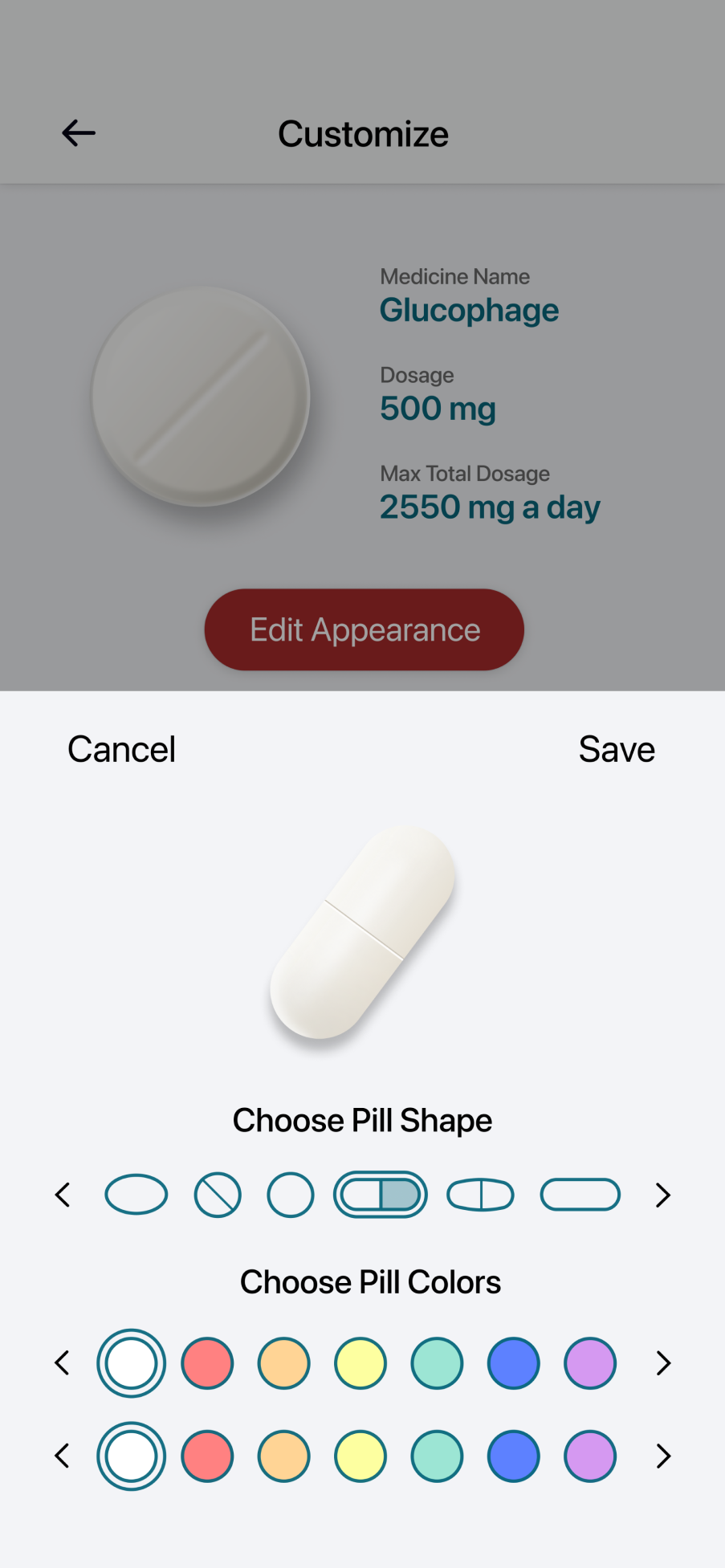
Customization Options: Users wanted a functioning change appearance feature for the pills. Most users from my usability study believed that having this function was a crucial part of an effective medicine reminder app.
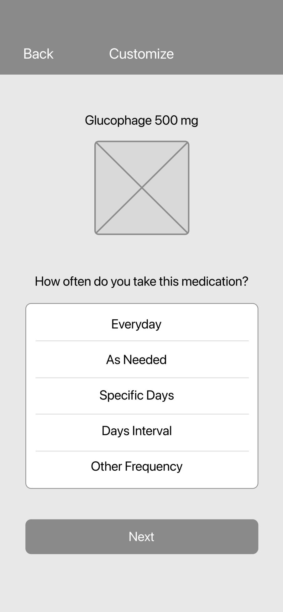
Before
After
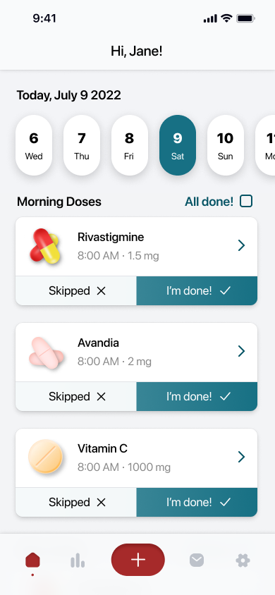
Navigation and User Flow: I decided to remove the two plus buttons and make the primary plus button have more color contrast with its surroundings. Additionally, I also included a new “All done” button that allows users to record their completion easily.
Before
After
Final product
The final high fidelity design
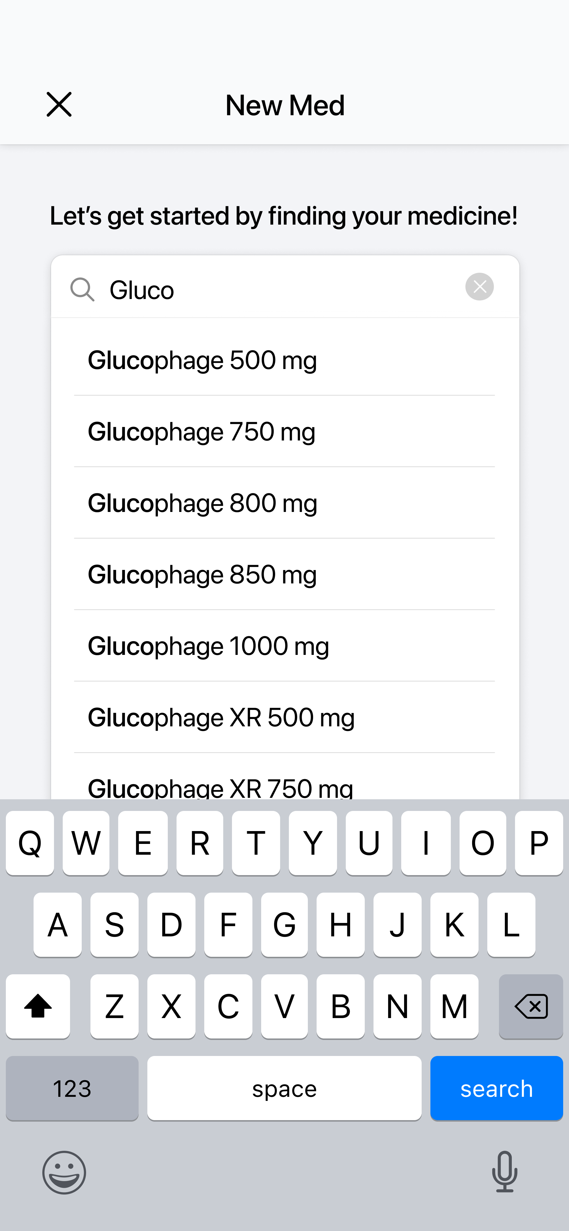
Here are the high fidelity screens we designed on Figma.

Home/Dashboard
Search
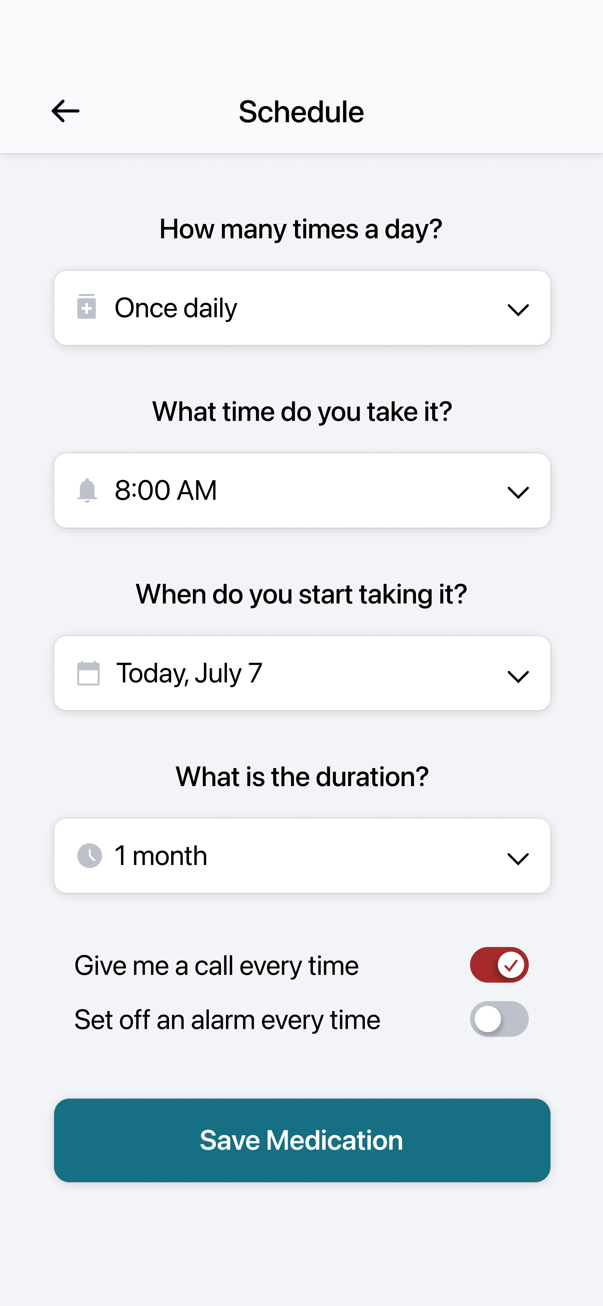
Scheduling
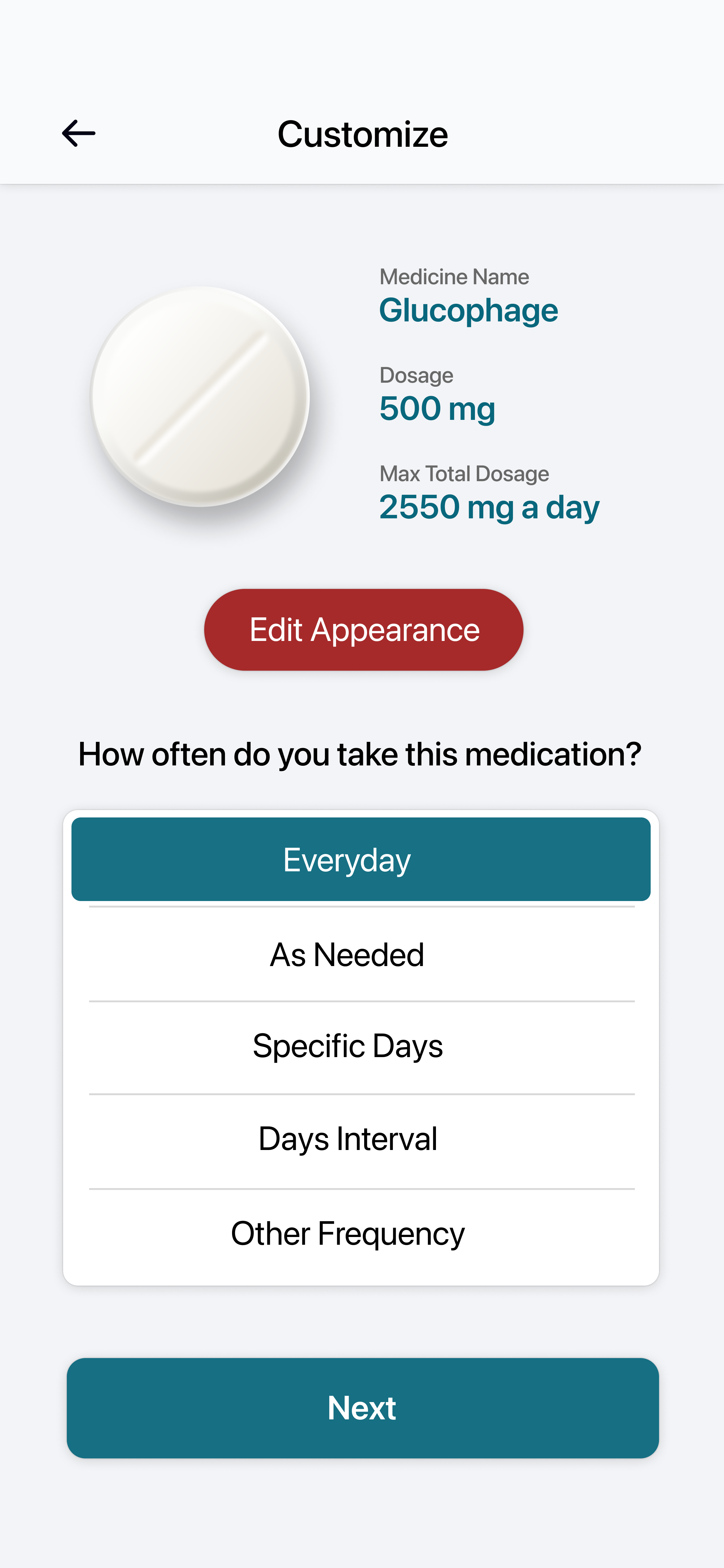
Customization
View hi-fi prototype
Cross Platform
Users should be able to access this anywhere!
Now that I have created a dedicated mobile app for MedTime. It would be good to have a web version of it as well. The web version is a responsive web design that adapts to different screen sizes, making on-the-go reminders even easier to achieve.
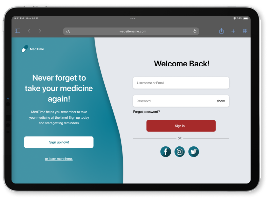
MedTime on Tablet
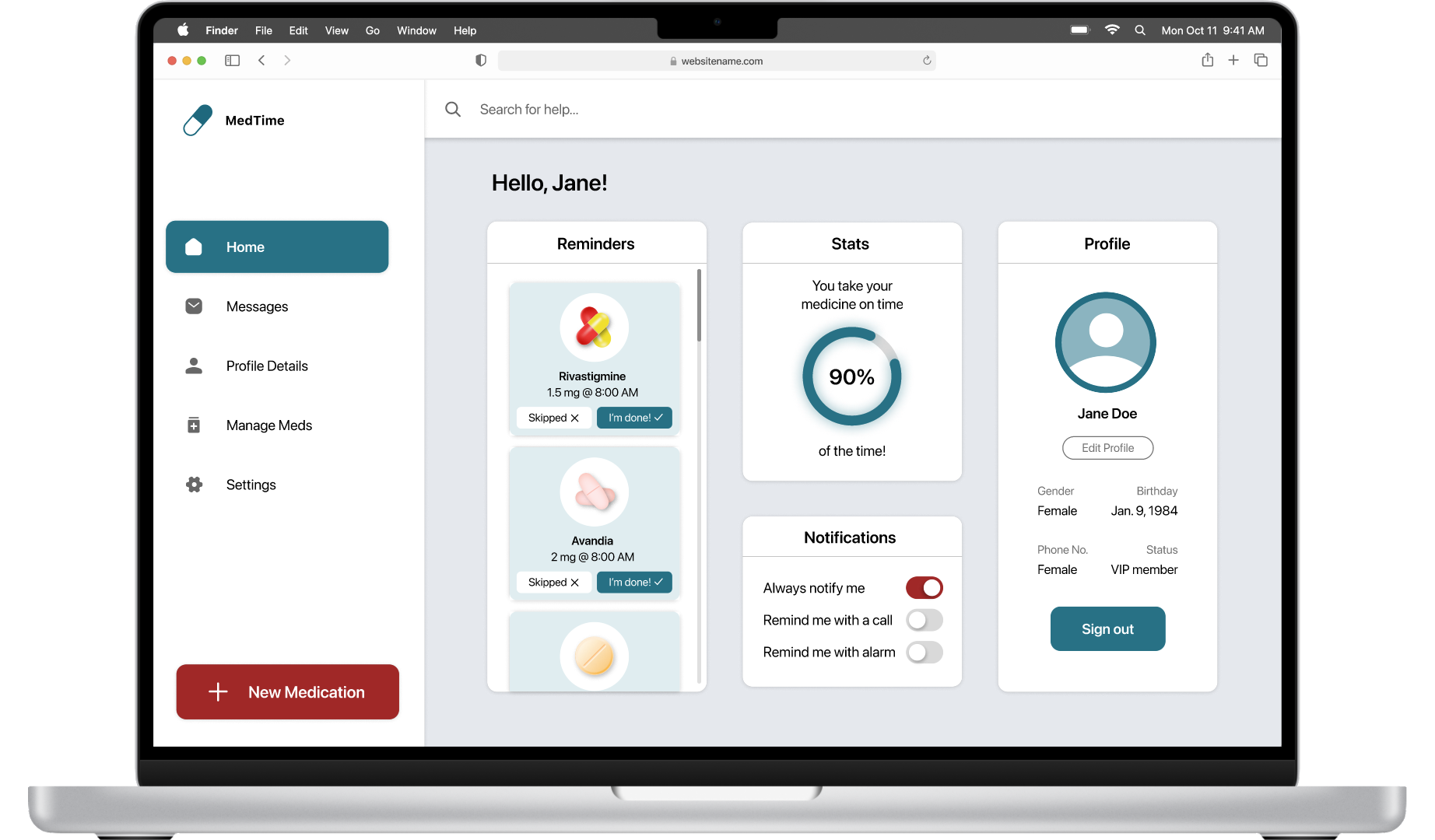
MedTime on Desktop
Final Product
MedTime's Style Guide
While I was creating my high fidelity prototype, I compiled the components that I used (buttons, typefaces, color schemes, etc) into a single sticker sheet.
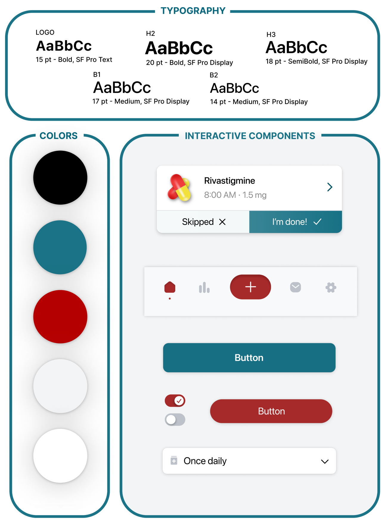
Style guide sheet
Accessibility
Taking accessibility into consideration
In my design, I included high contrast colors and bolded fonts for emphasis and ease of viewing. This allows for people with vision impairments to still read the text with less effort.
I also placed all the necessary functions of the primary user flow on the main page of the app, which means all the necessary features are able to be found in one place, allowing users to complete most tasks without navigation issues.
Takeaways
What I learned from this
I learned that designing for laptop and tablet are quite similar experiences because of their similar proportions. However, I thought that mobile apps and mobile sites would basically be the same, but there were many different considerations I had to make to transform the app into a mobile website design.

