overview
Reimagining Seven Seas Roasting Co.'s Website
Established in 2017, Seven Seas Roasting Co. is a specialty coffee roaster serving coffee across various locations in Southern California. Our client is the owner of Seven Seas, and we worked with him throughout a 10-week time frame to redesign Seven Seas' existing website.
problem statement
How might we design an intuitive online experience that reflects the Seven Seas atmosphere?
To kick off our project, my team and I met with the founder of Seven Seas Coffee to align project expectations. In this meeting, we identified the client's primary goals:
- Create a website that reflects coffee quality as the primary focus
- Update the navigation of the existing site to be more logical for first-time users
- Highlight services that currently have less traction, primarily subscriptions and wholesale
- Showcase the uniqueness of individual coffee shop locations
- Reflect the maritime branding in Seven Seas' physical locations on the new website
View creative brief
user interviews
Gathering site requirements from target users
After our initial client meeting, we conducted user interviews with 10 users, 7 of whom were customers at Seven Seas and 7 who were customers at other coffee shops. The goal of this interview session was to get a reality check on the requirements of our site, based on the perspective of target users of the site.
Some of the key insights we gathered from the interviews:
-
All interviewees go to specific coffee shops for 1 of 3 reasons
- The coffee quality is better than that of other coffee shops
- They need a location where they can study and work
- They are taste-testing coffees from many different locations
- Those who go to coffee shops to study often need to find out what amenities a location has to offer (free wifi, seating, etc.)
- Experimental coffee drinkers like to browse menus online before making a decision on which coffee shop to visit
View interview document
Transforming insights into personas
From the insights we gathered through interviews, along with the knowledge we gathered from the initial client meeting, we categorized our interviewees into three distinct groups that we developed into personas.
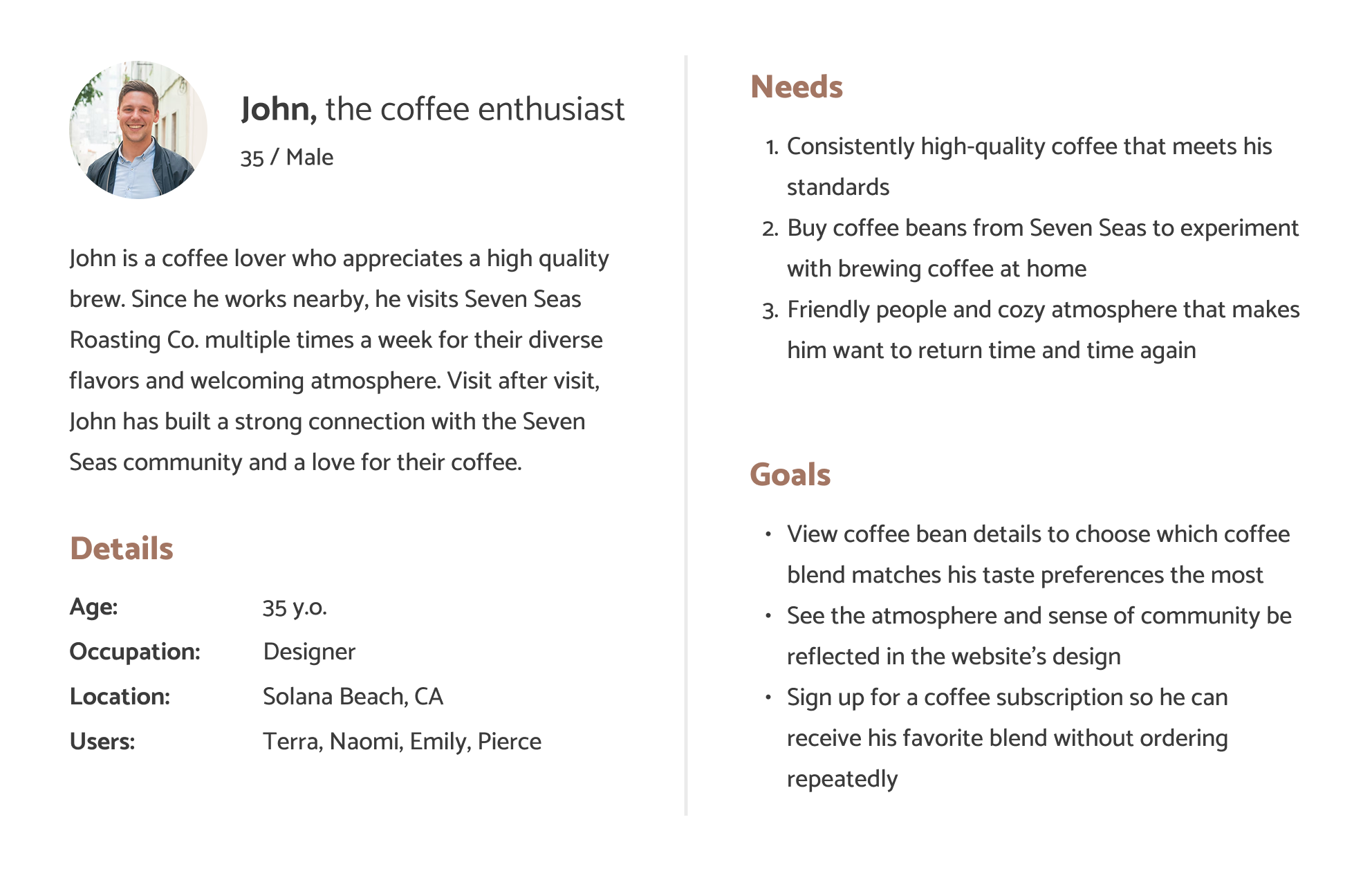
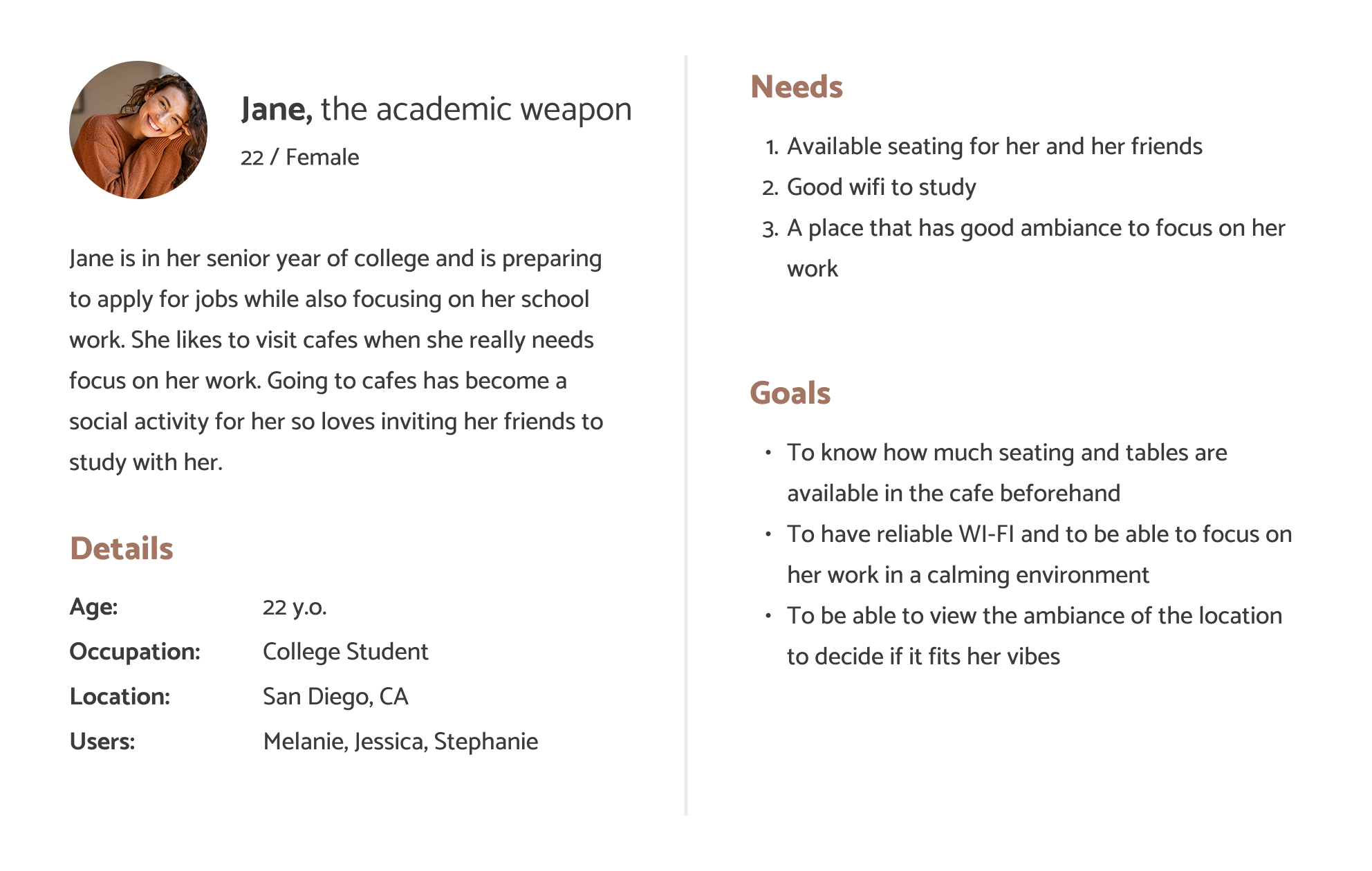
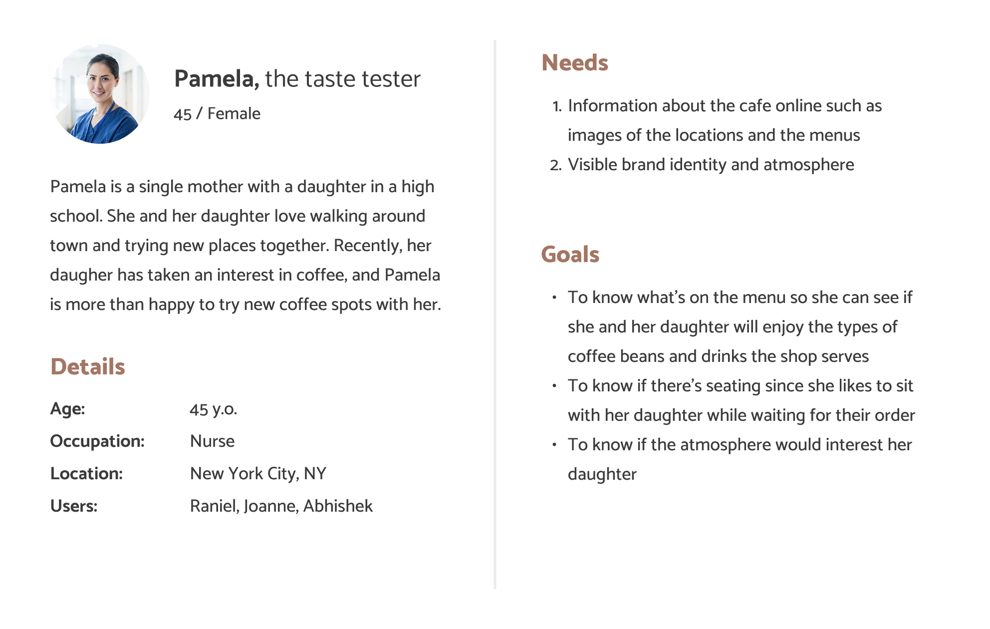
For each persona, we created user scenarios and user cases tailored to the Seven Seas website. Ultimately, we translated these findings into a functionality and features table, which included specifications that aligned with both user needs and client requests. Creating this table provided our team with a guideline to follow as we moved on to the next stages of our design.
Features and Functionality Table:
| Features | Client | Personas |
|---|---|---|
| Subscription + wholesale system | ☑ | Coffee enthusiast |
| Ratings and review system | Coffee enthusiast, Academic weapon, Taste tester | |
| Online menu | ☑ | Academic weapon, Taste tester |
| Coffee bean comparisons | Coffee enthusiast | |
| Updated coffee images + descriptions | ☑ | Coffee enthusiast |
| Emphasize the quality of coffee | ☑ | Coffee enthusiast, Academic weapon |
| More engaging content | ☑ | Taste tester |
| Showcase the uniqueness of coffee shop locations | ☑ | Academic weapon, Taste tester |
| Information on the interior of each location | ☑ | Academic weapon, Taste tester |
| Shares the backstory and sourcing of Seven Seas Roasting | ☑ | Coffee enthusiast |
| Sharing Seven Seas' impact on the community | ☑ | Coffee enthusiast |
| Strong branding | ☑ | Taste tester |
| Filter coffee selection | Coffee enthusiast, Taste tester | |
| View the ingredients in each menu item | Coffee enthusiast, Taste tester | |
| Reflect atmosphere + branding of storefront on website | ☑ | Coffee enthusiast, Taste tester, Academic weapon |
competitive audit
How can the competition inform our design decisions?
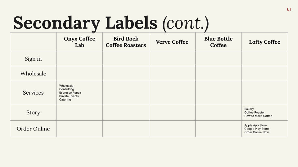
Before jumping into our designs, we conducted a competitor analysis to gauge the website designs of competing coffee brands. We chose these competitors because (1) our stakeholders mentioned a few of these examples as the ideal site design (Onyx/Verve), and (2) the others are popular local specialty coffee roasters with great website designs and content.
For each competitor, we conducted an in-depth analysis of their branding, functionality, content, and navigation. Ultimately, we synthesized our findings into a list of takeaways that we could implement on our website.
Onyx Coffee Roasters
Client thinks that Onyx has an "ideal design" for a coffee shop's website. Their website includes unique features like location amenities and coffee extraction guides. However, we found Onyx's navigation to be overwhelming due to having too many pages.

Onyx Coffee
Bird Rock Coffee Roasters
Bird Rock Coffee conveys a warm and beachy atmosphere with their website. They highlight all of their offerings and services with fun imagery and bubbly visual design. However, their website shifts the focus away from coffee visuals, which may confuse the visitors upon first impression.

Bird Rock Coffee
Verve Coffee Roasters
Verve Coffee has a modern and earthy vibe with its color schemes being muted and beige colors. Their site features a simple and minimalistic design that works to showcase coffee beans and subscriptions.

Verve Coffee
Blue Bottle Coffee
Blue Bottle's website showcases coffee through the use of simple and minmalistic imagery and icons. However, it's missing unique features that separates it apart from other coffee shop sites.

Blue Bottle Coffee
Lofty Coffee
Lofty Coffee's website focuses on their locally roasted coffee beans and products rather than on aesthetics. Their website is minimally styled, which makes it lack in terms of illustrating the atmosphere and branding of Lofty.

Lofty Coffee
Examples of good design ideas we took away from the analysis:
- Provide information, images, and menus for individual coffee shop locations
- It is important to use clear and concise menu labels so users can easily navigate between pages
- Add subscription and wholesale entry points into the home page
- Include a coffee subscription calculator, so users can figure out how much to order
View competitive analysis
branding
Representing the Seven Seas brand with colors and typography
Upon further communication with the client, we established that the new website should keep the current color scheme (red and black as primary colors) but give off a stronger maritime theme.
First, we created three different moodboards and potential style directions based on each one.

Moodboard 1

Style direction based on moodboard 1

Moodboard 2

Style direction based on moodboard 2

Moodboard 3

Style direction based on moodboard 3
Based on our client's preferences, we landed on direction 2 and put together a full-fledged style guide.

Style guide
prototyping
Testing our design with low-fidelity screens
Based on the research findings we had gathered so far, we created a bare-bones wireframe for a couple of the primary screens to ensure the new layout we had in mind worked well and felt more intuitive than the original.

Low-fidelity screens of the primary navigation pages
site architecture
Creating a more logical and navigable flow
Our client expressed concern that Seven Seas Coffee's existing website has a bad overall flow. To address this issue, we examined the site architecture of our competitors, creating a comprehensive table with all the menu and sub-menu items that are included within their site's navigation.
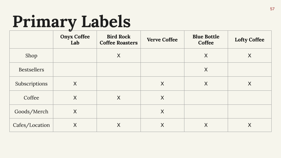
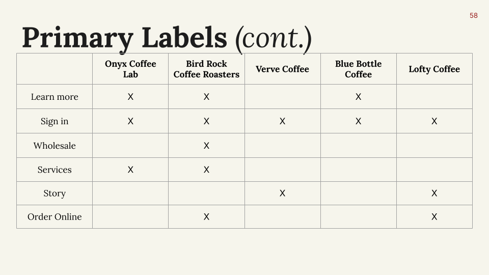
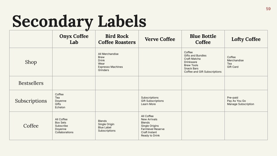
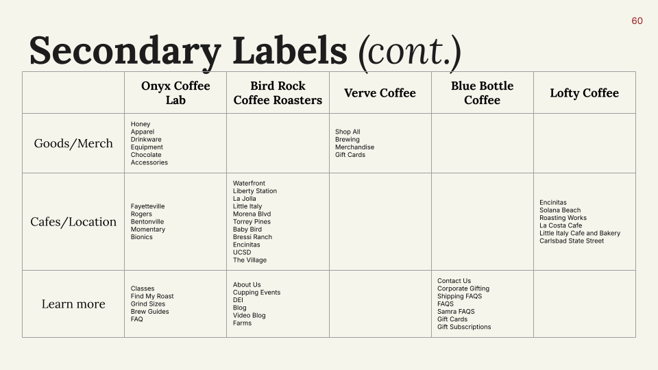
Additionally, we tested out the low-fidelity prototype and made tweaks to that navigation menu. Ultimately, using this table and the low-fidelity prototype as reference, we determined all the necessary pages needed in our new site and organized it into a revised sitemap.

New sitemap
prototyping
Designing the first version of high-fidelity screens
With our updated sitemap finalized, we moved on to creating our high-fidelity prototype.
First, we created the important building blocks and organized it into a stickersheet of components, which includes elements like navigation menus, button states, product carousels, etc:

Stickersheet of components
With these building blocks down, we were able to efficiently put together an initial high-fidelity prototype that included all the screens and functionalities we planned to have.
An in-depth look into the key functionalities
-01.png)
-02.png)
-03.png)
-04.png)
-05.png)
-06.png)
-07.png)
-08.png)
-09.png)
-10.png)
-11.png)
-12.png)
-13.png)
-14.png)
-15.png)
-16.png)
-17.png)
-18.png)
-19.png)
usability test
Addressing any usability and visual issues
To test our prototype, we first held a review session with other designers to assess the visual design details and overall interaction design from the eyes of designers.
What we changed:
- Navigation padding
- Quantity adjustment button style
- Add to cart preview
- Scroll behavior on prototype settings
- Desktop landing page
Then, we conducted a final user testing session on two users that we could fit within the timeline of the project, asking that they perform some of the important tasks in our website. Here's what we learned and what we fixed:
- User 1: After testing user 1, we learned that some buttons may not be obvious to find. The user found it difficult to find where to access the “Subscription Calculator.” To fix this, we decided to add a bigger button as another entry point to access the “Subscription Calculator” where it wasn't hidden. Another thing we fixed based on their feedback was the “Order Ahead” button on the menu page. The user found it very easy to overlook the “Order Ahead” button on top of the menu page when scrolling down. So to fix this, we decided to add a static “Order Ahead” button on the menu page where users can access this button anytime on the page.
- User 2: We learned that the coffee subscription calculator didn't have a visible enough call-to-action because the user struggled to find it. As mentioned above, we added a larger button to access the subscription calculator to make it more noticeable. The user mentioned that she could not go back between pages easily, which made navigation difficult. To address this, we will be adding swipe gestures to go back and forth between pages to mimic the behavior of mobile browsers. Additionally, she didn't like the placement of “subscription” in the navigation bar because it felt hidden when nested within “services.” After some consideration, we decided not to move the “subscription” out of the “services” tab because it would create too many primary labels in our navigation bar and potentially overwhelm visitors.
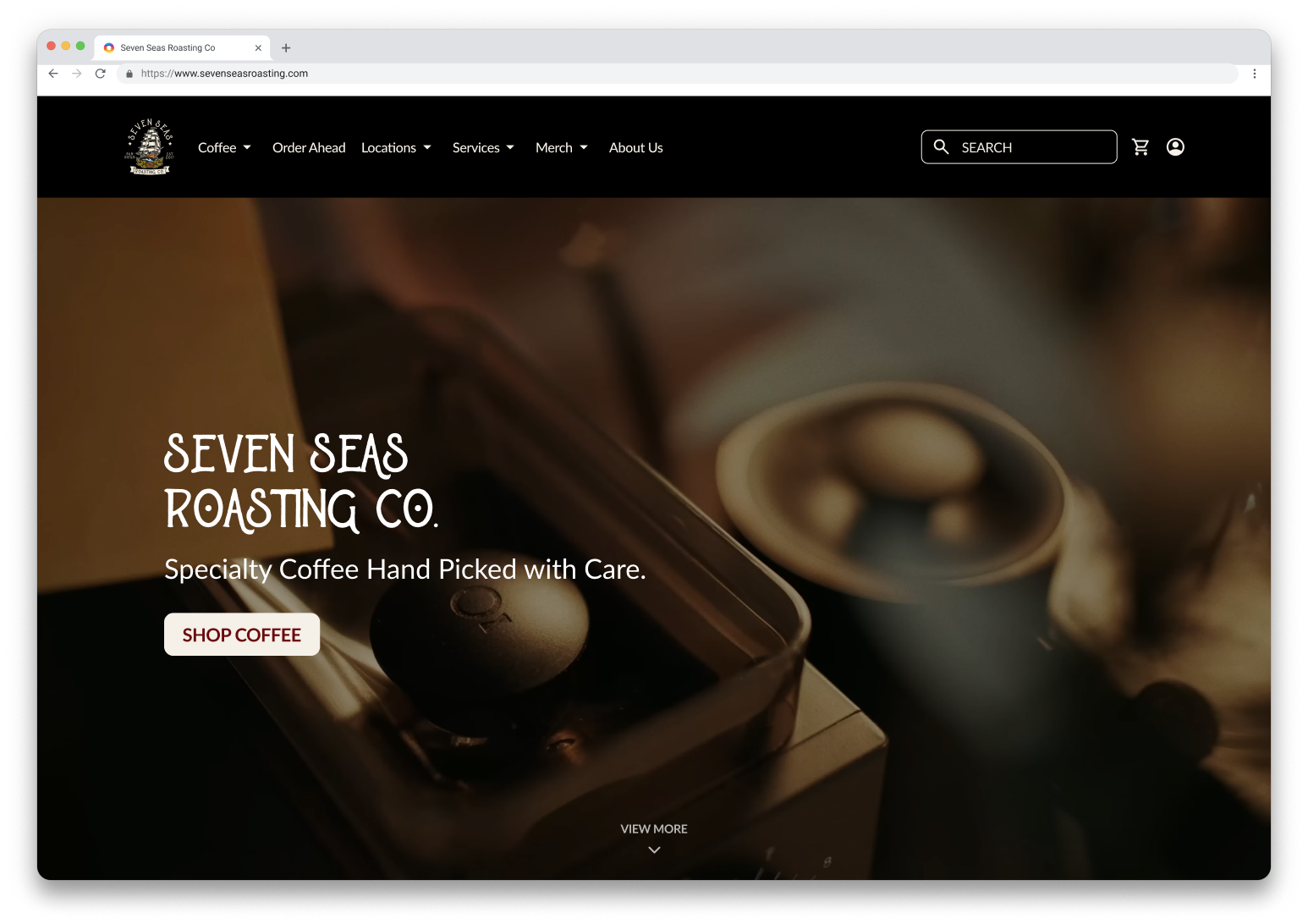
Final product
The final high fidelity design
Hover over the images to play videos of our final designs!
Landing page
Individual location page
Subscription page
About Seven Seas page
View prototype
Next steps
Handing designs off into development
Moving forward, we provided our client with all of our design assets and files, as well as an estimate for development time and cost based on our online research on various freelancing websites. Hopefully, we get to see our vision for Seven Seas Roasting Co. come true on their live site in the near future.
Takeaways
What I learned from this client project
This project was a great learning experience for me because it was my first time working so closely and directly with a client. Considering the limited time frame of the project, I think my team and I managed to create a product that we are all proud of, and I also learned so much out of it.
- Communicating with clients could be difficult, especially if we are given a limited time frame.
- It is useful to piggyback on other apps to test out our ideas
- Prototype sessions and feedback from our target audience offer practical advice on how to enhance the user experience